


Room to Breathe: How Visual Simplicity Builds Trust
 21 juillet 2026
Content Management – ViGlob 360
Does your website breathe? At first glance, the question may not mean much. But let’s be honest, you have probably visited a cluttered, confusing website where your eyes didn’t know where to land, and you left without even knowing why.
Good news: the answer comes down to five simple points, and ViGlob 360 helps you see things clearly.
6-minute read | 5 points | July 2026
Space, hierarchy and consistency: these small details make all the difference between a website that inspires trust and one that drives visitors away.
Let’s demystify the expression together, and we’ll give you the keys to assess, in just 6 minutes, whether your website is breathing well.
1. What is a “website that breathes”?
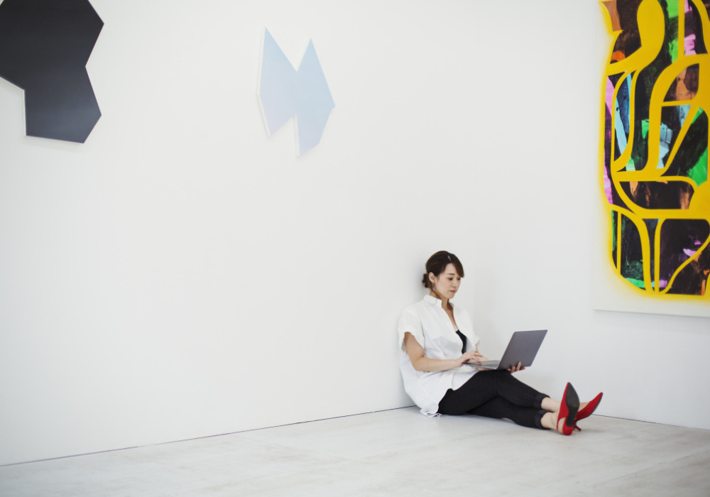
The expression comes from graphic and web design. It refers to a website with enough empty space, known as “white space”: between lines, around images and between sections. A website that “breathes” leaves room for air, like a tidy room rather than a cluttered warehouse.
The opposite is a dense website where everything is crammed together: too many menus, too much text, too many images side by side. The eye no longer knows where to land. This is sometimes called a “pizza page”: a page so crowded that it looks like a menu board listing every possible topping, with no distinction between what matters and what doesn’t. And just like an overloaded pizza, when you try to include everything, you end up unable to taste anything clearly.
2. Does design really influence visitor trust?
Yes, and here’s why. Faced with a website featuring 15 menus, text everywhere and clashing colours, your first reaction isn’t “wow, they offer so many services,” but rather “this is complicated, I don’t know where to start.” That confusion quickly turns into distrust, even unconsciously: we associate visual clutter with a lack of professionalism, even when the content is excellent.
Conversely, a clear website gives the impression that the organization knows what it is doing. Too many images or too much information right from the start can even drive away a visitor who could have quickly found what they were looking for. Trust is often built before a single word is read, simply through visual impression. Try it: visit several websites, then come back to yours. It might be an eye-opener.
3. Why is this reflection essential for an organization?
An organization with a community vision, serving members or clients, has an important responsibility: to make access and understanding easy, not just to exist online.
Websites often leave room for interpretation: Do I need to register somewhere else? Do I have to be a member to get help? Am I even on the right website? A clear website is a form of respect for visitors, especially those looking for help or information quickly. We often think we should focus on the big picture rather than the details, but on a website, both matter equally.
Let’s take a concrete example: someone lands on your website because they are going through a difficult time and need help quickly. If they have to dig through several menus or read long paragraphs before finding a phone number, they may leave before getting help, at the very moment they need it most. A “Need help?” button clearly visible on the homepage can make all the difference between someone who feels welcomed and someone who feels lost.
4. Visual hierarchy: where do your eyes go first?
A website that breathes isn’t just about “fewer things”; it’s also about knowing where the eye should go first. On a page, not everything can carry the same weight. Keep this in mind when designing: within barely three seconds, the eye lands somewhere on the page, and that first glance should fall on what truly matters, not on a secondary element.
The main heading should also clearly stand out from the rest, whether through its size, colour or position, to naturally guide the reader.
Above all, a page benefits from having a single, clearly visible call-to-action button (“Contact Us,” “Donate,” “Register”) rather than five competing for attention and ultimately diluting the visitor’s focus. If you must have several, make sure they are very clear and well spaced, so visitors don’t feel overwhelmed by too many choices at once.
5. Consistency: does it look the same from one page to the next?
Trust is also built through reassuring repetition. If every page of your website has a different layout, different colours and different heading styles, visitors feel as though they are switching websites with every click, which creates doubt, however slight, about the organization’s professionalism.
Keep this in mind when designing: headings, buttons and colours should be used the same way throughout, so visitors instinctively recognize they are still in the same place, whether on the homepage or the “About Us” page.
The tone of your text matters too: whether formal, warm or direct, it should remain the same from one page to the next.
Consistency is a bit like a person with a steady voice: it’s reassuring, even if we can’t quite say why.
In Conclusion
A website that breathes is not an aesthetic luxury. It sends a silent message: that of an organization that took the time to think about the person on the other side of the screen.
For an organization with a community vision, this isn’t just a design issue; it’s an extension of your values. Respect for your members or users doesn’t stop at in-person service. It begins with the very first click.
The next time you visit your own website, look at it with fresh eyes. Ask yourself the questions we’ve explored: do my images, my text, my structure and my language truly serve the person visiting me?
A website that breathes is one that says, without saying it: welcome, we thought of you.
Additional Questions to Ask Yourself (for Your Website Audit)
Images
- Are there too many on a single page?
- Does each image truly support the page’s topic, or is it merely decorative?
- Are my banners too busy for the call-to-action button to remain visible and clear?
- Are the size, quality or resolution of my images slowing down my website’s loading time?
Text
- Is there too much text at once, with no visual break?
- Can I shorten sentences or paragraphs without losing meaning?
- Am I using the language my visitors typically use, or am I speaking in more technical, internal or administrative terms than they do?
- Does each page have one clear topic, or is it trying to say everything at once?
Structure
- Are there clear subheadings that make it easy to scan the page quickly (without reading everything)?
- Does the main menu have too many options? (General rule: 5 to 7 items maximum)
- Are the menu labels too long? (One or two words are usually enough; avoid full sentences)
- Can a visitor in a hurry find what they’re looking for in under
10 seconds?
Ready to give your website room to breathe?
Contact our team of design experts and discover how ViGlob 360 can transform your online image.
A clear website takes planning, and we’re here to support you!
Let’s talk about your design project
Our team is available to assess your needs and recommend the best options.
Source : Smart Tips by Val
Retour